chapter 1:
about
Why creative websites?
←
CREATIVITY
<_<
Creative websites are the
intersection of creativity
and technicality to form
bespoke digital expierences
that spark emotion.
about
This project is dedicated to the methodology behind crafting websites that pushes boundaries. Our process values curiosity iteration, and experimentation. View some of our techniques on creating projects that leave a lasting impression.
Design &
Development
chapter:
02
chapters
chapter 2.1: grids & layouts
CURRENT GRID SPECS
Grids & Layouts
Using a grid can assist in creative cohesive,
precise and satisfying layouts by aligning
and grouping elements within the grid.
There are different types of grids, but the 12 column grid is the most commonly used grid because of it’s flexibility.
try these different layouts
↓
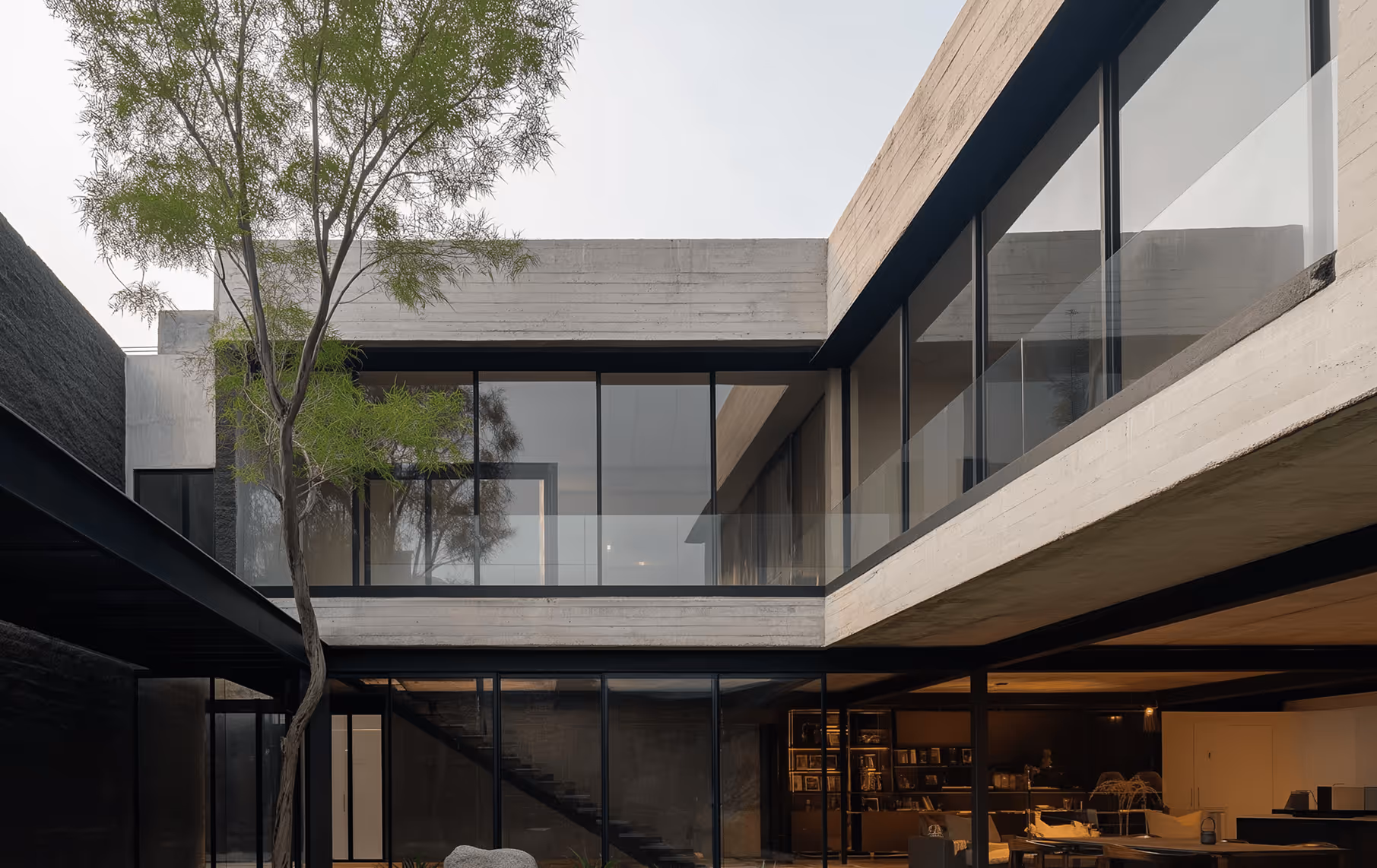
We are a multidisciplinary design studio specializing in bespoke residential projects.
However, grids are just guidelines
and breaking out of a grid can form completely different designs.
Chapter 2.2 Type Fundamentals
Typography.
Typography.
Typography.
Typography sets the foundation of any creative websites, period. Whether you’re trying to establish a strong first impression or communicating a message to a target audience, your type has to be dialed in and align with your story and identity.
Type usage in
award winning sites
A brief breakdown behind typefaces behind our projects.

For S-2K, the goal was to express the car’s duality of technical precision and raw emotion. A combination of contemporary sans-serif and a monospace typeface to mirrors its multifaceted character that’s inspired directly from the car’s design language.
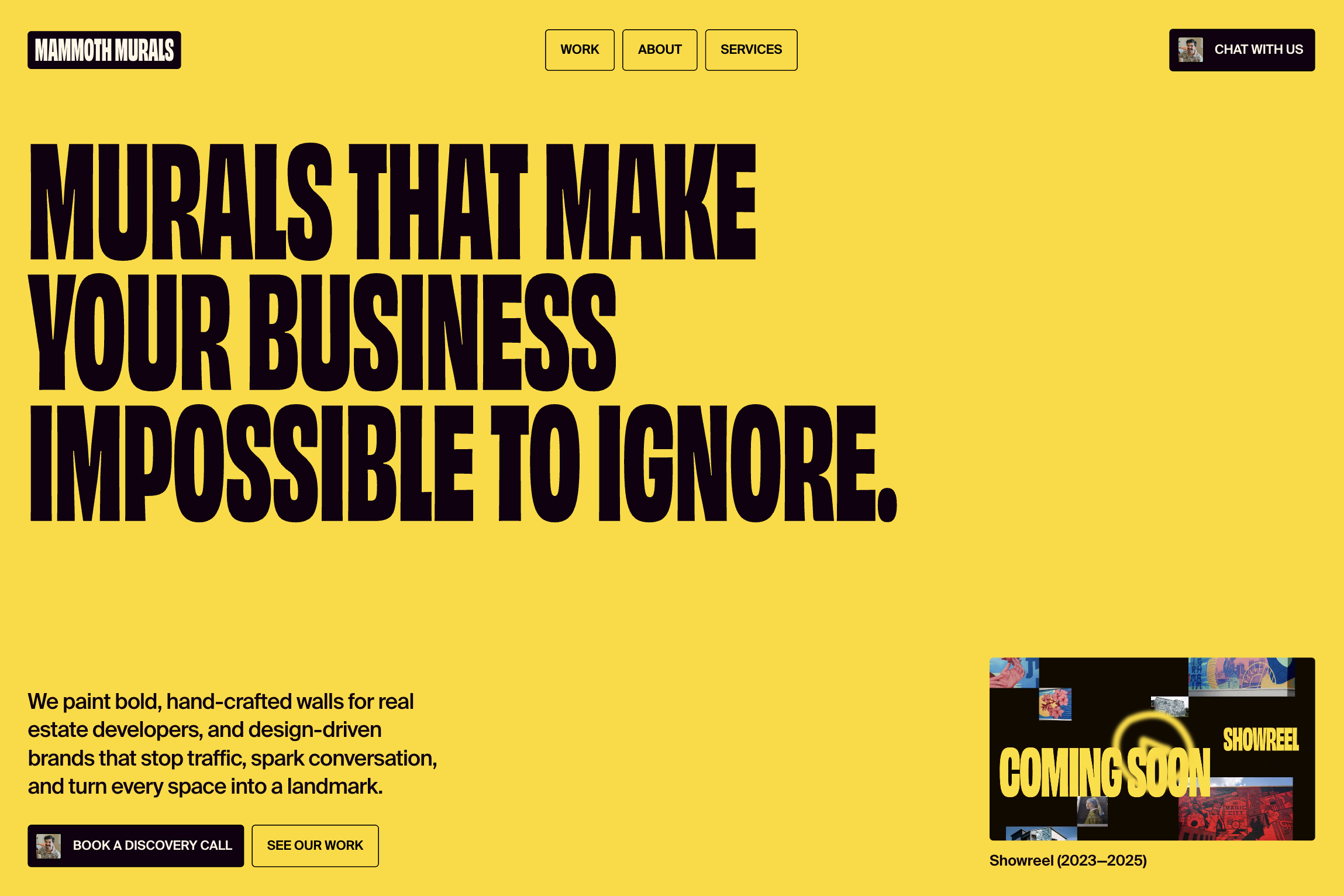
For Mammoth Murals, we used Obviously Condensed Black to position them as the bold choice in a safe market, creating strong hierarchy that guided users to inquiry points. Suisse for body copy balanced impact with readability and professionalism.
chapter 2.3
Colors
Every award-winning site shares one thing: intentional color. It’s not picked from a palette, it’s designed to evoke, to direct, and to tell a story.
Examples
Colors on a website are rarely picked from colors or any typical palettes. Rather it’s a combination of carefully using the right accent colors to highlight a specific element or emotion and using secondary and primary colors to support it.
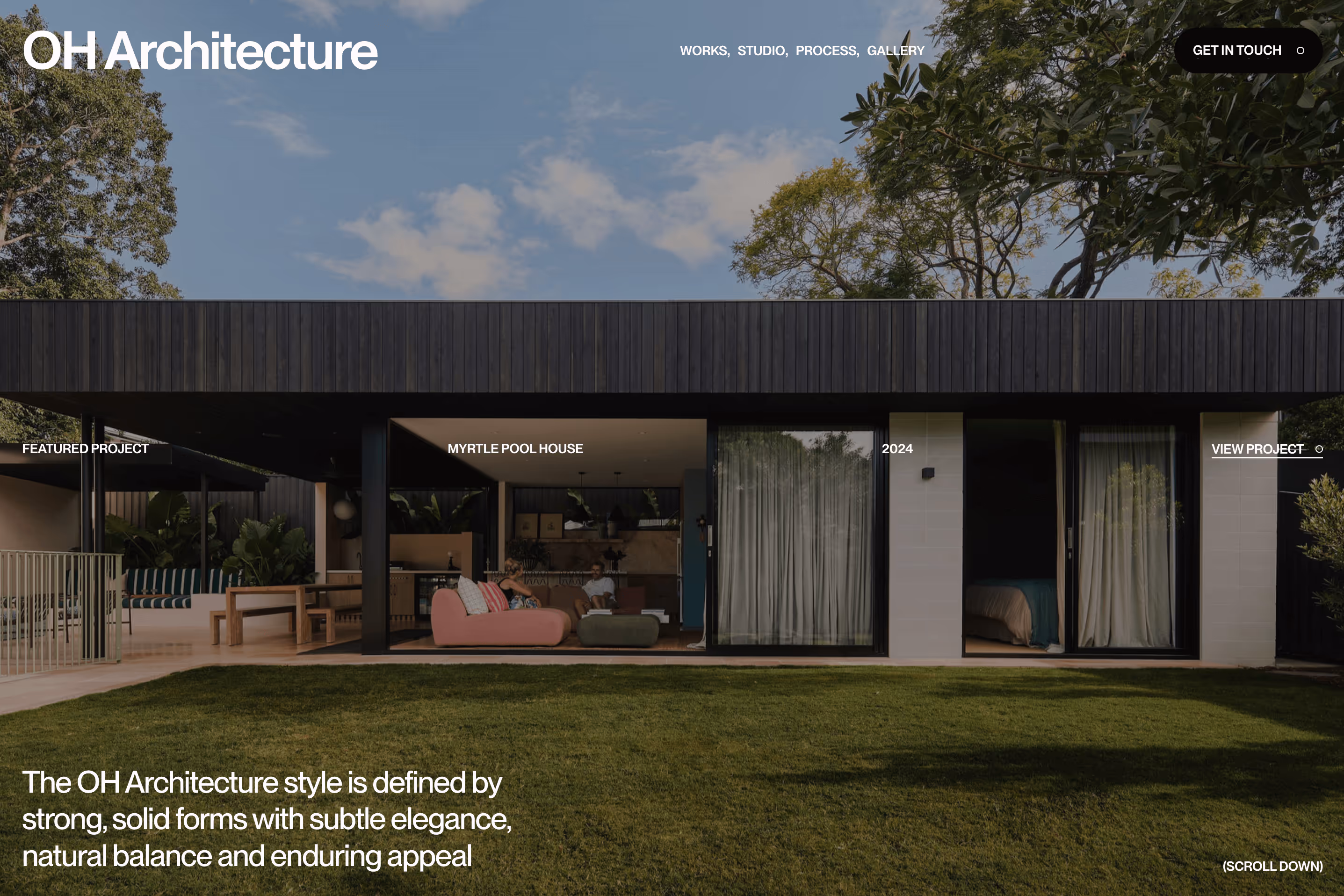
We used a monochromatic system to reflect OH Architecture's minimalist design philosophy. Subtle shade variations added dimension while maintaining the refined, gallery-like experience their work demands.
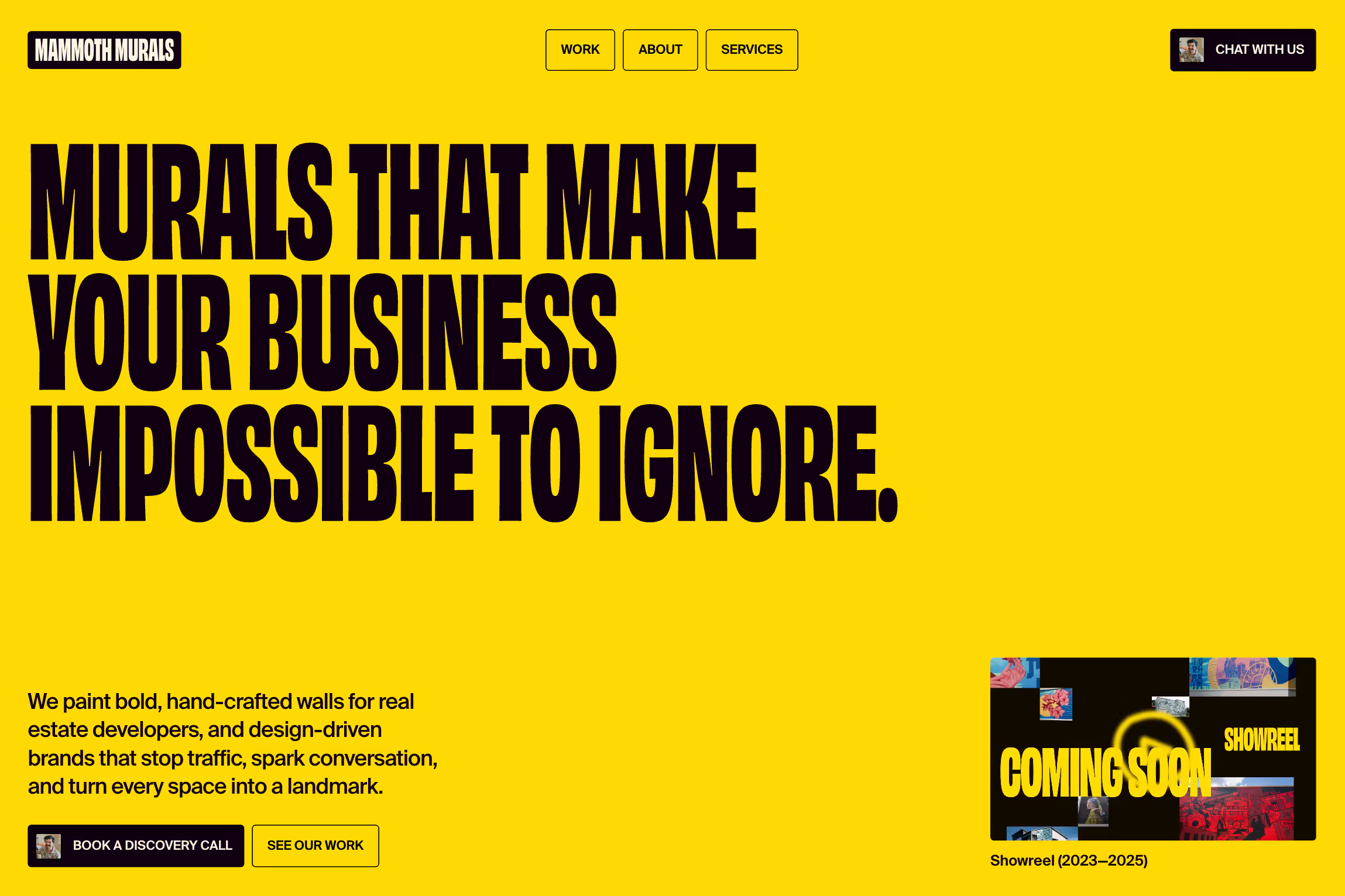
To elevate Mammoth Murals beyond typical mural contractors, we built a monochrome foundation that positions their work as fine art. Yellow and blue accents inject the brand's playful energy at critical moments.
chapter 2.4
Motion
Animation
Interaction
Animations can truly make a website come to life. It can tastefully enhance the user experience by drawing attention and establishing a feeling of a website.
Methods
Any element can be animated, but here are some of the most common ways to implement motion for the web.
01
34
text
02
hover
03
icons
04
scrolling
Use delays, staggers, and easings to make more organic animations.
Just like in nature, nothing moves in straight lines, every motion influences the next. Delays and easings create that organic rhythm, turning motion into flow.
examples of micro-interactions
Well-crafted micro interactions can turn a plain website into an engaging, memorable experience—making every click, hover, and scroll feel smoother, smarter, and more delightful for your users.
chapter 3: Final word
And last but not least, it is important for you to constantly...
Put in the reps
Create passion projects, experiment with animations, and explore new design ideas. The more you build, break, and refine, the sharper your creative instincts get. Make connections, refine your taste, and have fun making websites.